31 Jan Top 5 Web Design Trends to Watch for in 2019
We all know trends can be flaky and nowhere it’s more apparent than web design. What is popular today might not be popular tomorrow. The tides will continue to shift.
Fortunately, there are a few things you can foretell based on where most websites are headed. And if you can successfully do so, you can crush your competition before they even know what hit them.
Gathered are top five innovative web design trends that your online business or web design agency can follow in 2019:
The Rise of Playful Cursors
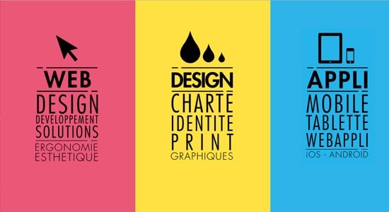
The traditional cursor serves just one purpose; get you where you want to go in a blink of an eye with a simple click. For years, it remained a disregarded element on websites because changing it seemed unnecessary to all those providing web design services given that it serves no aesthetic function.
But times are changing. Now more and more websites are opting for interesting and interactive designs, which has opened a new pathway for cursors too.
Most of all, the aesthetics of the cursor are rapidly changing and most of the time it syncs with the style of the web in question. For instance, if it’s a site about photography, your web design agency might turn the cursor into the center dot of a camera, so you can use it to snap the ‘pictures’ of different parts of the site you want to access.
This means gone are the days of just pointing and clicking. These days, you can even click and hold certain elements to get a video to play or a GIF to load on modern websites.
In fact, you get to see different functions based on whether you hold or click the mouse, giving your web development partner more room to play with interactive parts.
Screen Dominating Text Set to Rule the Web
In 2019, text in web design will continue to thrive under the content first approach. For years, content specialists have argued that content should be at the heart of your strategy when it comes to publishing.
Sure, it seemed obvious in theory, but in practice, people providing web design services failed to pay heed to this aspect for years. Despite the fact that it’s one of the most important parts of the website.
Fortunately, we’ve stepped in the era where content is pushed to the forefront once again. Companies offering top software development companies are now reintroduced to the letterforms and websites are giving text center stage.
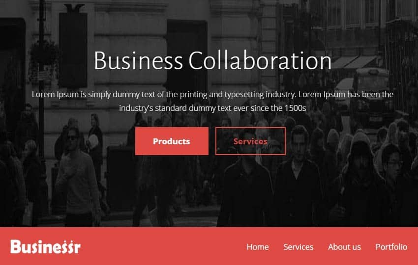
This welcome change is represented with huge letters on the home page of many websites. Huge fragmented textual messages on web pages instantly grab visitors’ attention, which perfectly serves the purpose of the message being displayed.
Whether it’s a worthwhile message or not, it still makes the visitors feel like it’s something urgent. At times the digital marketing agencies intentionally keep the font too large just to add an additional level of urgency.
Impactful Black & White With a Cherry on Top
Colors are something that can change the way people see your website. That’s why picking the right hues for your site is one of the most important things to consider.
People associate different moods with different colors and designers have taken advantage of this since the dawn of the internet. Though getting rid of most colors doesn’t seem like an effective idea, designers are becoming creative with the two most simple colors—black and white.
The two colors have always remained an interesting pair of art. One reflects openness and light, while the other is the absolute opposite, makes you feel imprisoned. Modern websites are leveraging these colors because they feel more professional and also allow the designers to show off their skills.
Lately, this trend has seen a surge, but this time around your digital marketing agency might use them with a minimum of other colors to emphasize something important. For example, gentle shade of red behind an element sticks out like a cherry on top.
Most importantly, using black and white with other colors allows you to grasp the attention of your users the way you like while maintaining the aesthetics.
Helvetica to Dominate Logo Designs
With websites getting more vibrant and intriguing over time, the same can’t be said about website logos. The common logo is now given a new face-lift.
Last year, we witnessed an increase in playful wordmarks to represent the eccentric side of the brands. But this time, they are looking to achieve the minimalistic look of sans-serifs or similar styles. In a few words, every popular brand you see is now getting a Helvetica version of their logo.
While some brands may benefit from this simple approach, others might not be appreciated as much. Because this kind of cold design starts to annoy some people.
This might be a symbol of maturity and growth, but the lack of eccentricity will certainly remove the warmth from certain logos.
Conclusion
At times experience tells you what to look for when you are designing a website, while other times you are just following the rising trend. But the most important thing is to always stay ahead of your competition. And BuzzInterative is recognized as a Top Website Design Company on DesignRush.


